
Rebranding Clothing Brand Monogram Logo - Angels Reborn
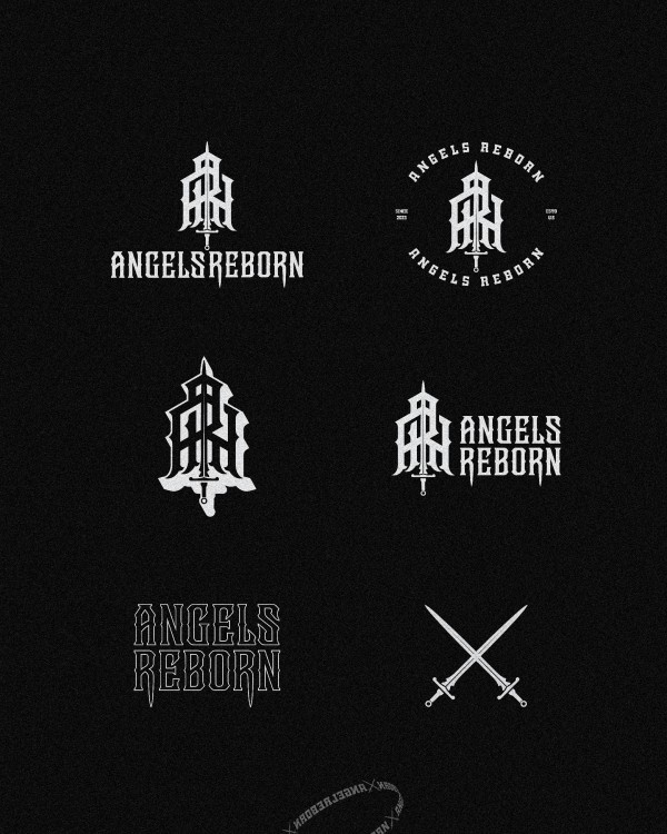

 \

THE CHALLENGE
The previous logo was too generic, easy to forget. It lacked a strong symbol to reflect the brand’s soul. Gen Z and young adults crave meaning, not just style.
The edgy-modern vibe was losing its direction.
THE SOLUTION
To revive the brand, we created a bold, unforgettable mark. A sword was added to the monogram—more than a design choice, it’s a message:
“Every angel who rises must be ready to fight.” This new logo captures the essence of Angels Reborn—for those who fall, rise stronger, and stand tall with purpose and power.

Logo Grid System – Angels Reborn
The grid system used in the Angels Reborn logo ensures that every element—monogram, sword, and wordmark—is aligned with precision, balance, and visual consistency.
Purpose of the Grid:
Visual balance between the symbol and the text. Precision in spacing, alignment, and proportions. Consistency across various sizes and placements. Ease of reproduction on different media
The Result:
A clean and professional look. Harmonious spacing and rhythm between letters A strong, unified logo composition that holds its integrity in any context
The grid makes sure the logo stands tall and stable—whether it’s displayed on a billboard, clothing tag, or digital screen. It’s not just design—it’s structure.


